What Worked
The sequence of tokens → base components → complex patterns, one documentation template for every component, a staged rollout, and regular demos with the full team.
How I replaced manual screen-by-screen design with one system of tokens, components, and rules. Frontend engineers and QA could work directly from the specs without asking for clarification on every state.
Context
NOTA.Vizor is a tax monitoring platform. Large companies use it to share data and reports with Russia’s Federal Tax Service, run internal controls, and connect to the Nalog-3 system. The full product background is covered in the previous case study.
Role
I proposed the design system, designed it from scratch, and carried it through rollout. I did this alongside ongoing product work, with no dedicated project time and no second designer.
The work followed four stages: tokens and styles → base components → legacy-screen refactoring → product rollout.
Challenges
The frontend team built the production component library directly from my specs. With no Ant Design or Vue UI kit underneath, the documentation had to cover behavior, states, and edge cases precisely.
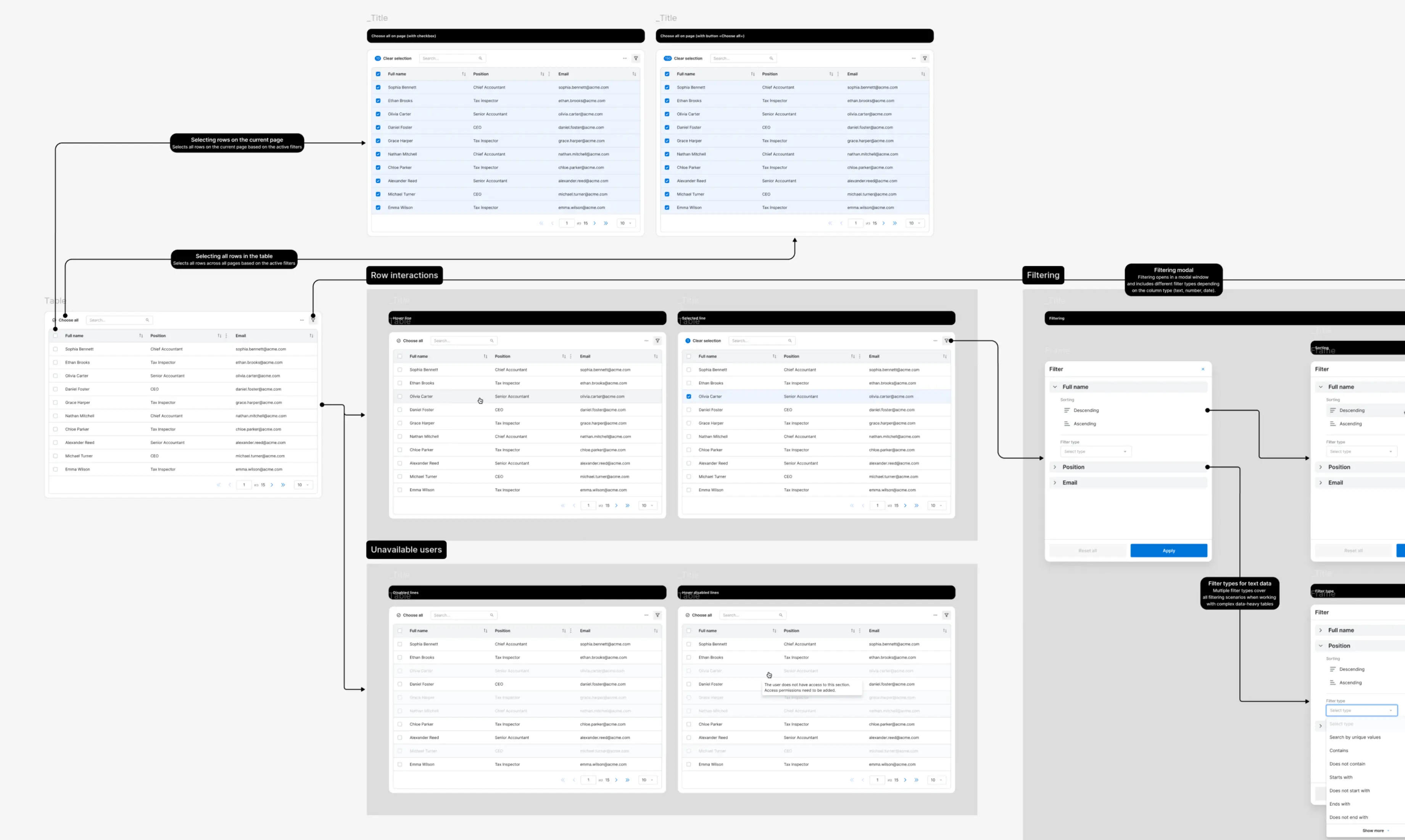
The table component had to support multiple row densities, column alignment, sorting, row and cell states, and inline editing. I broke that behavior into configurable properties so each table variant could be assembled instead of redrawn for every screen.
The left and right panels behaved differently depending on the screen. Some requirements became clear only when the components were tested in real workflows. I refined the specs over several iterations until they worked consistently for both design and frontend development.
Standards
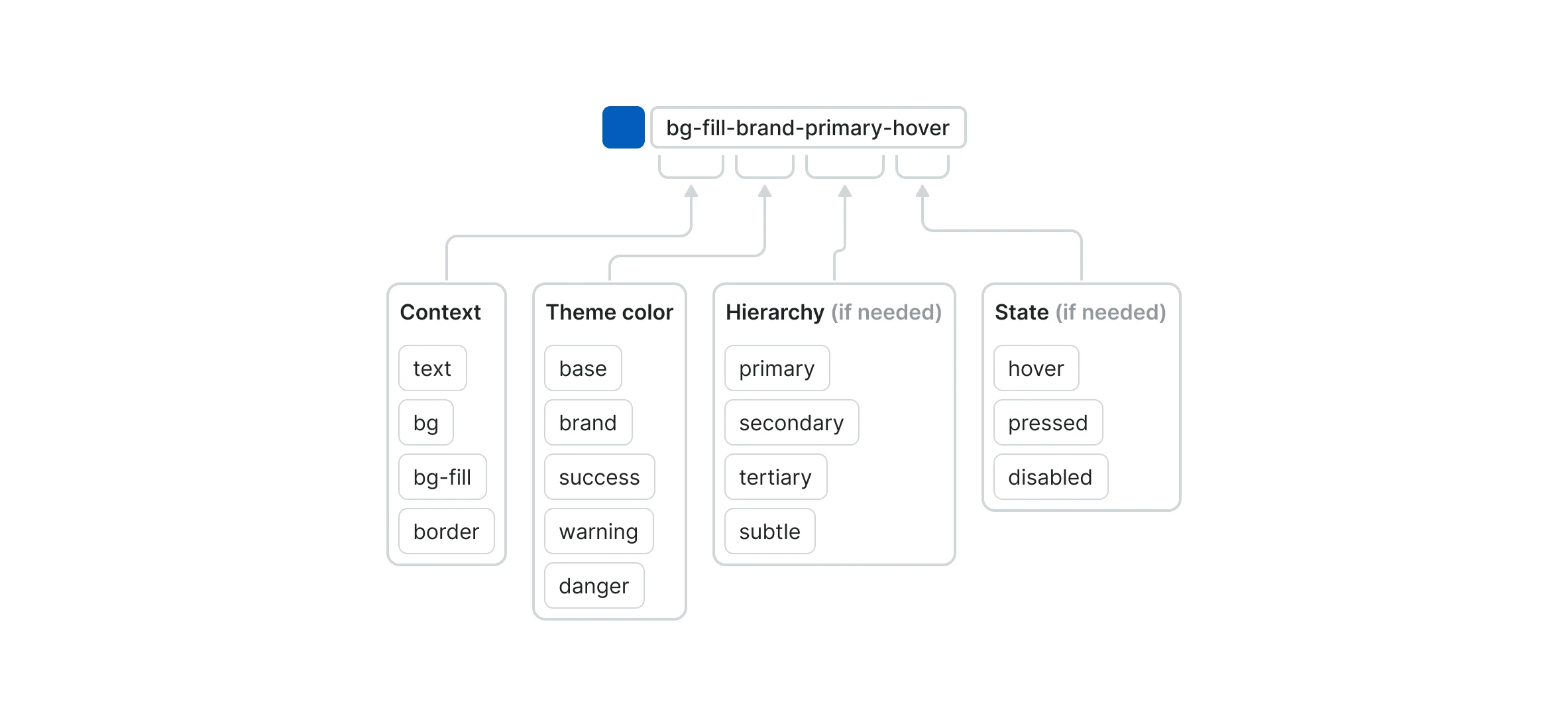
Each token name followed the same structure, using up to four parts. Simple names stayed short; state and hierarchy were added only when needed.
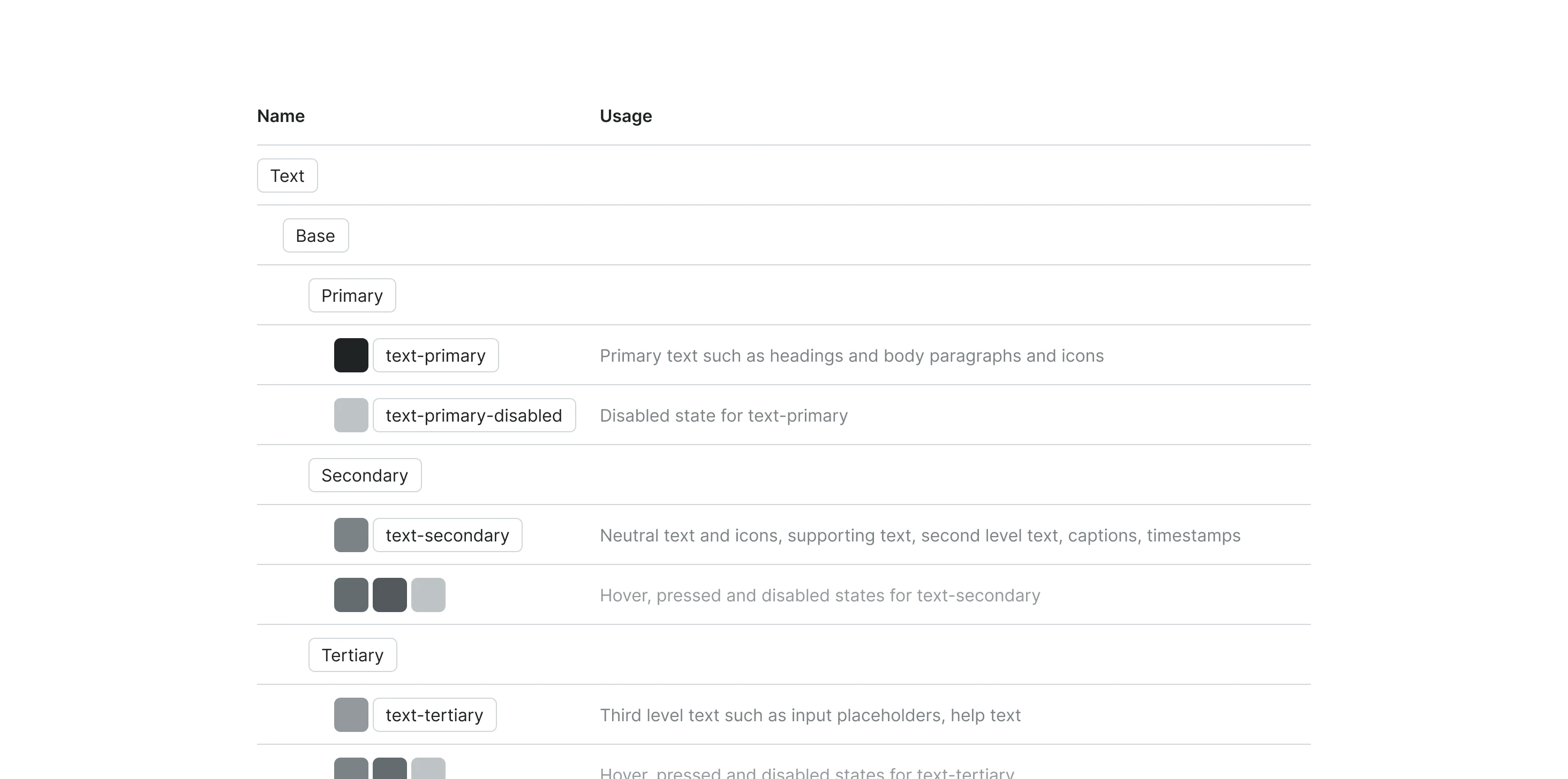
Instead of choosing “the third gray,” the team used semantic names: text-primary for body
copy and headings, text-tertiary for placeholders and help text, and text-danger for
errors and destructive actions.
Library
The core library included Button, Input, Select, Multiselect, Table, Modal, Alert, Pagination, and Tabs. I also documented recurring patterns for tables and forms: empty states, inline editing, validation, and error messages.
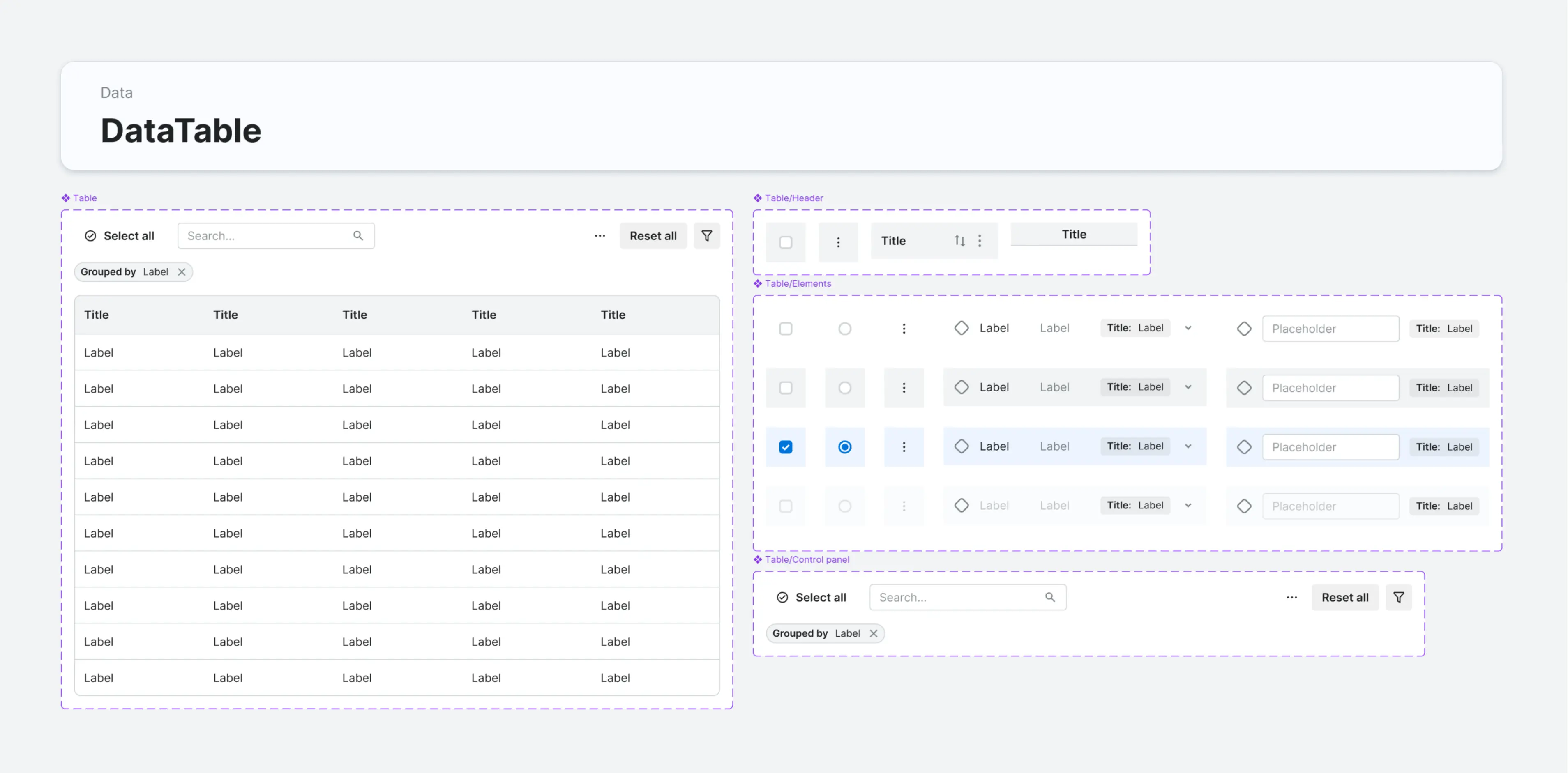
Each component included its purpose, properties, states, edge cases, and do/don’t examples. Frontend engineers and QA could work from the specs without repeatedly coming back to design for clarification.
Process
I did not design the library in isolation. I tested each new layer on real product screens. That exposed problems that were invisible in a standalone component: insufficient contrast, spacing that broke in context, and missing edge cases.
When an issue was systemic, I returned to the tokens or base components, fixed it there, and tested it again in complex workflows. The frontend team reviewed each stage, so problems did not accumulate until the end.
The rollout moved from lower-risk elements to more complex ones: styles, buttons, and inputs first; tables, filters, and forms next. The product owner approved the overall direction, while ongoing changes were reviewed with the frontend team in demos and design reviews.
Results
These figures are team estimates based on production work during the rollout, not the results of a controlled study.
−40%
Design speed
−70%
UI quality
3–4 → 1–2
Communication
<5%
Standardization
Retrospective
The sequence of tokens → base components → complex patterns, one documentation template for every component, a staged rollout, and regular demos with the full team.
I would bring complex patterns into the process earlier, especially tables and the right-side panel. Their real behavior surfaced late and added unnecessary iterations.